
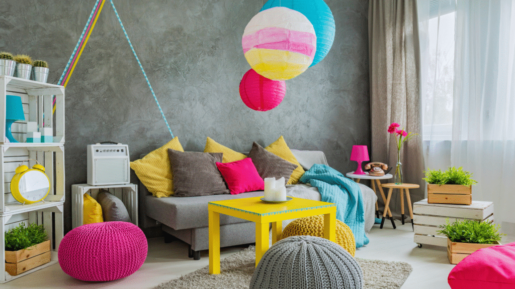
Choosing the right color combinations can transform any home, creating a harmonious and appealing environment. Certain color palettes consistently enhance the aesthetic of living spaces, making them timeless and versatile. These combinations not only suit various styles but also reflect personal taste while maintaining an inviting atmosphere.
Neutral tones mixed with pops of color offer a balanced look that appeals to many. For instance, pairing soft grays with vibrant yellows or blues can create a refreshing yet calming space. Similarly, earth tones like taupe or olive green combined with warm accents add depth and character to any room.
Exploring these top color combinations can inspire homeowners to reimagine their spaces. With the right choices, they can ensure that every room feels cohesive and welcoming, no matter the season or trend.
Foundations of Timeless Color Combinations
Timeless color combinations stem from a deep understanding of color theory and their psychological impact on users. By considering calm, serenity, and the influence of bright colors, individuals can create environments that resonate positively.
Understanding Color Theory
Color theory serves as the backbone of effective design choices. It involves the study of how colors interact and the emotions they evoke. The color wheel is crucial, featuring primary, secondary, and tertiary colors.
Complementary colors, those opposite each other on the wheel, provide contrast and vibrancy. Analogous colors, which sit next to each other, ensure harmony.
When designing a space, knowing how these colors work together aids in crafting a balanced feel. The right combinations can energize a room or promote relaxation, making them fundamental to interior design.
Many homeowners find that choosing colors is only the first step in a larger home update. Working with a professional luxury home remodeler helps turn these color ideas into actual structural changes. These experts know how to balance paint choices with high-end materials like marble and custom wood. They can also change the layout of a room to let in more natural light, which changes how colors look during the day. This practical approach makes sure the final design is both beautiful and useful.
The Role of Calm and Serenity in Interiors
Incorporating colors that convey calmness can greatly enhance the livability of a space. Shades such as soft blues, greens, and neutral tones are often associated with tranquility.
These colors are ideal for bedrooms and relaxation areas, fostering a serene atmosphere.
Designers recommend using cooler colors in spaces intended for meditation or rest. They help reduce stress and improve focus.
Balanced with warm accents, one can create a cozy environment without overwhelming the senses.
Impact of Bright Colours on User Experience
Bright colors invoke energy and stimulate creativity. Shades like sunny yellows, lively reds, and vibrant oranges can enhance moods. They are particularly effective in areas designed for social interaction or activity.
Incorporating these colors can draw attention to specific areas, guiding movement within a space. However, moderation is key; excessive bright colors can be overwhelming.
Using bright colors as focal points—like an accent wall or decorative pieces—can provide bursts of energy while maintaining a balanced environment. Thoughtful application creates engaging spaces without sacrificing comfort.
Top Color Combinations That Work in Any Home
Choosing the right color combinations can enhance the aesthetic appeal of any home. Specific pairings can evoke different moods and create a harmonious environment.
White and Sky Blue
White and sky blue create a refreshing and airy feel in any space. This combination is ideal for coastal or modern-themed interiors.
Benefits:
- Brightness: White reflects light, making rooms appear larger.
- Calmness: Sky blue evokes tranquility, perfect for bedrooms or living areas.
For a cohesive look, use white for walls and sky blue for accents like cushions or artwork. The interplay between these colors promotes a serene atmosphere.
Red and Illuminating
Pairing red with illuminating yellow can energize spaces. This bold combination works well in kitchens or playrooms where an active vibe is beneficial.
Key Points:
- Energy: Red is stimulating and can boost mood and creativity.
- Contrast: Illuminating yellow softens the intensity of red, making it more inviting.
Consider mixing red furniture with yellow accessories, such as lampshades or artwork, to create an engaging focal point without overwhelming the senses.
Lime Green Accents
Lime green paired with neutral tones adds vibrancy without being overpowering. This combination is excellent for living rooms or home offices.
Why Choose Lime Green?
- Versatility: It pairs well with shades like beige or gray.
- Freshness: Lime green injects a lively feel, enhancing mood.
Incorporate lime green through throw pillows, rugs, or wall art against a neutral backdrop. This approach maintains sophistication while adding a touch of fun.
Neutral Tones with Bright Pops
Using neutral tones, such as beige or taupe, with bright accent colors creates balance. This strategy allows personalization in any room.
Implementation:
- Foundation: Neutral colors provide a calm canvas.
- Pops of Color: Bright colors like orange, teal, or magenta can be used for cushions or decorative items.
This combination allows flexibility. Homeowners can easily update the look with new accents as trends change or personal preferences evolve.
Enhancing Spaces With Color for Modern Lifestyles
Modern lifestyles demand environments that are visually appealing and functional. Color plays a crucial role in creating spaces that resonate on social media and in marketing, making them essential for contemporary living.
Balancing Colors for Social Media Appeal
Color choices can significantly influence how a space is perceived online. Soft pastel palettes offer a calming effect, while bold, vibrant hues can energize a room.
When designing for social media, consider these tips:
- Contrast: Use contrasting colors to highlight features or create focal points.
- Consistency: Maintain a cohesive color scheme throughout spaces to enhance visual harmony.
Incorporating elements like statement walls or colorful décor can elevate posts on platforms like Instagram. Users tend to engage more with photos showcasing well-balanced colors that evoke emotion.
Advertising Strategies for Colorful Interiors
Colorful interiors can enhance marketing efforts by attracting attention and conveying brand identity. Warm colors like red and orange can stimulate appetite, making them ideal for restaurants, while cool tones like blue and green promote calmness, suitable for spas and wellness centers.
Key strategies include:
- Color Psychology: Understanding how colors affect emotions and behaviors can guide color choice.
- Brand Alignment: Choose colors that reflect the brand’s personality and values.
Using color in advertising can increase visibility and memorability, making a property more appealing to potential clients. Colorful images in advertisements provide a striking visual that draws viewers in.
Optimizing and Personalizing Color Choices
Choosing the right color combinations for home design involves more than aesthetics; it encompasses the use of data-driven insights and personalized strategies. By leveraging analytics and tailoring preferences, individuals can create spaces that truly reflect their unique tastes.
Leveraging Analytics and Cookies for Style Preferences
Analytics play a crucial role in understanding style preferences. Homeowners can utilize data from websites that track user interactions. This data can reveal color trends and combinations that resonate with their tastes.
Cookies store information about previous visits and preferences, making it possible to tailor suggestions. Platforms that analyze these patterns offer recommendations based on specific user behavior. For instance, if an individual frequently views certain color palettes, the platform can prioritize similar options in future selections.
Customizing Cookie Preferences in Home Design
Customizing cookie preferences allows users to have a more personalized experience. By adjusting settings, individuals can control which data is collected and how it influences recommendations.
This customization can enhance the design process. For example, by agreeing to specific cookies, a user may receive targeted suggestions for color combinations that align with their style. Adjusting these settings can help refine choices and contribute to a more satisfying design experience.
Targeted Advertising of Interior Color Trends
Targeted advertising is another tool for discovering trending color combinations. Through analytics, brands can reach specific audiences based on their interests and previous interactions.
As users browse design websites or social media, they may see ads that feature popular color schemes. These ads are curated with the user’s preferences in mind, allowing them to explore new ideas and styles they may not have considered.
This approach not only enhances the shopping experience but also informs users about the latest trends in interior design. Engaging with targeted ads can lead to inspiration for color choices that are both modern and suitable for any home.